Hello friends, Happy 4th of July!
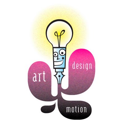
I spent the weekend relaxing, taking in a Madonna concert, watching fireworks, and creating a new identity for my website. Check it out. I'm still tweaking it a bit, but I'm liking where I've arrived so far. My old idea-pen logo still exists in my masthead above, but I think this reworked version is more progressive. What do you think?
Also, check out my portfolio website: www.justinwinslow.com
I've added a bunch of new illustrations to the gallery.
Hope you had a great holiday!

7 comments:
not bad at all, indeed you are a master with the inkpen!
I like this...it feels very modern, very '60s. Am curious about your work method. Do you start with an ink drawing and scan that and trace in Illustrator, then add color in Photoshop? What tools do you use? Your color and lines always seem so clean...thanks in advance for your feedback.
Thanks piero, thanks anonymous. I try my best. I'm attempting to polish my existing style for commercial work.
Tell ya what, anonymous, send me an email revealing who you are and I'll send you an email revealing my secrets!
its CRAYONS!!!
HEY i like ptik creis wnlw's response!!! and i'll ditto that!
;-D
v
You guessed it...it's CRAYONS!!! That's the secret!
I miss you, ptik creis wnlw & v!!!
Excellent job here, Justin! I like the sleeker look for the fountain pen. It definitely takes it to the next level, giving the potential client a chance to see some of your design capabilities. Cool stuff!
Post a Comment