Hee hee hee...
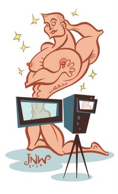
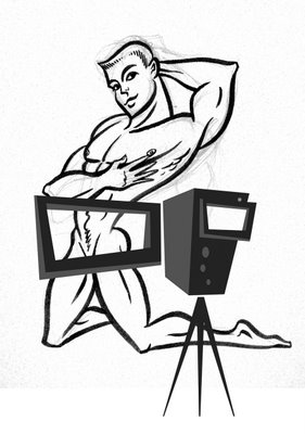
I just did another illo for the weekly column. The piece was about objectification and pornography. Here's how it turned out. Initially, I drew the guy more seriously (see sketch below), trying to make him alluring and sexy, but it looked forced and stiff (NO pun intended).
So, I did this version above, off the cuff, without much of an under-drawing...and I like it WAY more than the first one. I think it has a fun energy to it. It's funny - sometimes you just have to go with the flow - go with the natural flow of the ink lines, so to speak. I'm learning to trust my instincts more. Instincts are such an important part of drawing. I like how he looks so silly, and so grotesquely bloated, and like he's trying to be "pretty". I like how this kinds of pokes fun at the whole idea of objectifying someone. Aren't we all beautiful in our own little ways? Aren't we all ugly, too?
I realize, of course, that the viewfinder isn't large enough to cover much. Although, it doesn't look as if there's all that much to cover.


7 comments:
Let's see the original as a comparison...a "before" for the "after".
Wow! Sexy!
To mr. "anonymous":
I added the original sketch I did, for comparison, per your request. Sure wish I had a name/face to connect with you...
Thanks, arschblog!!!
Thanks for posting both images...wow, what a difference between the two! I get something out of both of them, actually...the first sketch seeming more akin to the retro, tart, pin-up queens of the '50s; the second one feeling much more contemporary and with a bit more to say about our current views of body image/weight struggles/magazine models. (There's emotion in both, but, stylisticallly they say two distinctly different things.) This is a valuable lesson to artists to try one style, then put that piece away (literally) and start over to see just what happens...you can always go back to the original, after all. I also appreciate the preliminary pencil sketch lines underneith the permanent ink on the first sketch...evidence that you were there making every mark. My eye prefers work that's a little "dirty" (read, "real" and not all pretty-clean-digital-finished), if you know what I mean.
Wow, thanks anonymous. What great, thorough, insightful comments you've made. Thank you for that. For taking the time to write all of that. I really appreciate this kind of feedback. I know what you mean about "real, dirty" work compared to "digital, clean" work, and I know I have difficulty decided between the two. There's a certain rawness and energy to pencil sketches and doodles that gets lost in digitally-finished work. I try and try to hold onto it, but it's difficult, when working in the computer makes everything so clean. On the other hand, there's a designer side to me that loves things all perfect, polished, and buttoned-up. It's really hard to find a happy medium between both! Often, I end up feeling schizophrenic!
yeah the second versionis wayy funnier! what a great job!
I would enjoy seeing more of your doodles. Before you begin using the computer.
It would help me know more about the "real" justin, whom I find rather fascinating.
I like what I see, but I also want to see......... what's going on in your mind before you digitize.
Post a Comment